The kitchen isn’t just a room; it’s the heart of the home. It’s a space for creation, conversation, and connection. From the morning coffee ritual to festive family dinners, the kitchen is where life happens. When designing this central hub, we meticulously choose cabinets, countertops, and appliances. Yet, one of the most powerful tools in our design arsenal is often an afterthought: color. The right color palette can transform a kitchen from merely functional to truly sensational, and there’s no better place to make a colorful statement than your backsplash.
This guide will dive into the fascinating worlds of color theory and psychology to help you choose the perfect tile for your kitchen. By understanding how colors interact and influence our mood, you can select a backsplash that not only complements your decor but also creates the exact atmosphere you desire.
The Language of Color: A Crash Course in Color Theory
Before you start picking out tiles, it helps to understand the basic principles that govern how colors work together. Think of it as learning the grammar of design.
The Color Wheel
At the core of color theory is the color wheel, a visual representation of the relationships between colors.
- Primary Colors: Red, yellow, and blue. These are the foundational colors from which all other colors are derived.
- Secondary Colors: Orange, green, and violet. These are created by mixing two primary colors.
- Tertiary Colors: These are made by mixing a primary and a secondary color, resulting in shades like blue-green or red-orange.
Color Temperature
All of these colors have a “temperature” that affects the overall feel of a room.
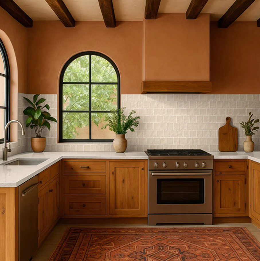
- Warm Colors: Reds, oranges, and yellows are associated with sunlight and heat. They are energizing, inviting, and are even known to stimulate the appetite, making them a natural fit for a kitchen. They can make a large space feel cozier and more intimate.
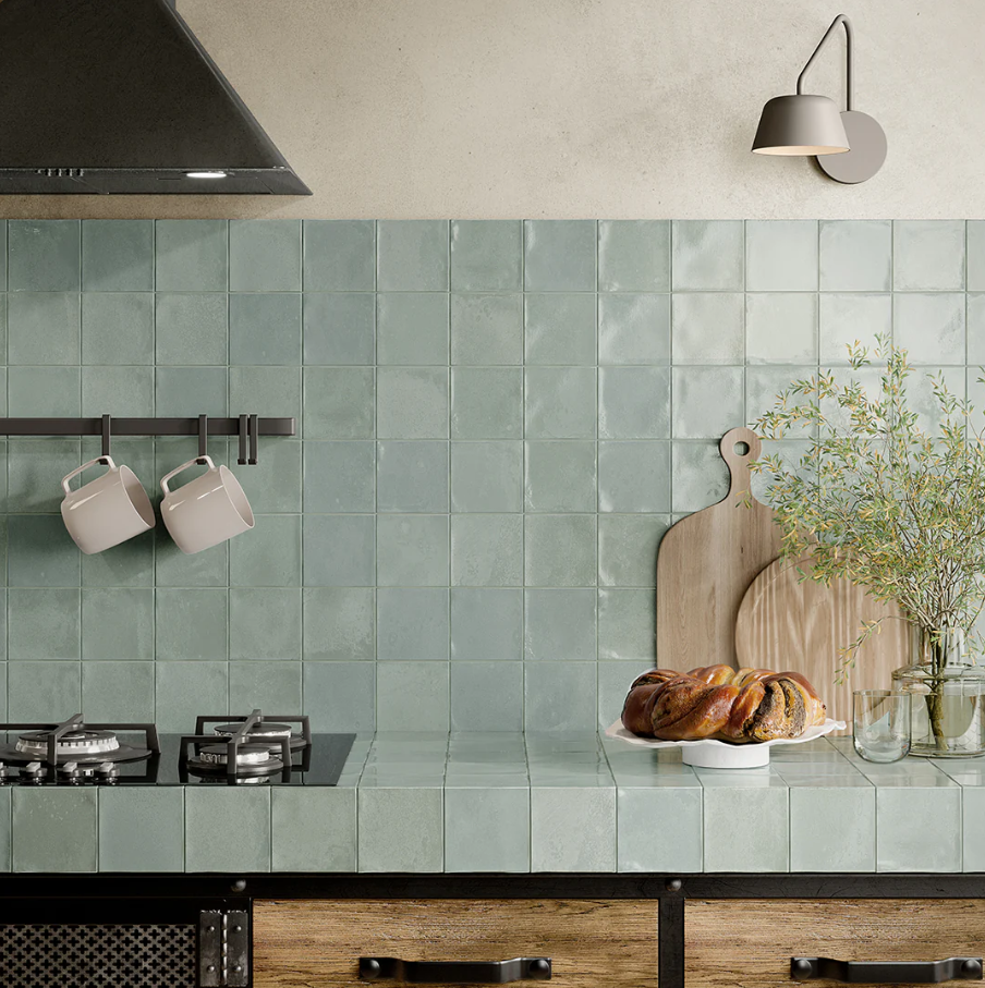
- Cool Colors: Blues, greens, and purples evoke a sense of calm and serenity. Associated with water and nature, they can make a small kitchen feel more open and spacious. They’re perfect for creating a clean, crisp, and tranquil environment.
Classic Color Schemes
How do you combine these colors for a flawless look? Designers often turn to a few time-tested color schemes.
- Monochromatic: This scheme uses various tones, tints, and shades of a single color. A kitchen with a light blue backsplash, navy blue cabinets, and pale blue walls is a perfect example. It creates a sophisticated, serene, and cohesive look.
- Analogous: This approach uses colors that sit next to each other on the color wheel, such as green, yellow-green, and yellow. It creates a low-contrast, harmonious, and comfortable design.
- Complementary: For a bold, high-impact look, a complementary scheme uses colors directly opposite each other on the color wheel, like blue and orange or red and green. This high-contrast pairing is vibrant and dynamic.
- Triadic: This scheme uses three colors evenly spaced on the color wheel, such as red, yellow, and blue. It offers strong visual contrast while retaining balance and color richness.
Kitchen Color Psychology: More Than Meets the Eye
Color doesn’t just look pretty; it makes us feel things. Color psychology explores how different hues influence our mood and behavior. Choosing a backsplash color is an opportunity to infuse your kitchen with the right energy.
- Soothing Blues: Blue is the color of calm, stability, and serenity. It can lower blood pressure and create a peaceful atmosphere. A blue backsplash can turn your kitchen into a tranquil oasis, perfect for unwinding after a long day. It’s a clean, classic choice that pairs beautifully with white cabinets and marble countertops.
- Natural Greens: Associated with nature, health, and renewal, green is a grounding and balanced color. From earthy sage to vibrant emerald, a green tile backsplash can breathe life into your kitchen, connecting it to the outdoors and promoting a sense of well-being and freshness.
- Classic Whites: White symbolizes purity, cleanliness, and simplicity. A white backsplash is a timeless choice that can make a kitchen feel larger, brighter, and more open. It’s incredibly versatile, providing a blank canvas that allows you to introduce pops of color through accessories and decor.
- Elegant Greys: Grey is the ultimate modern neutral. It speaks of sophistication, balance, and elegance. A grey backsplash can be warm or cool, providing a sleek, contemporary foundation that complements a wide range of materials, from stainless steel to natural wood.
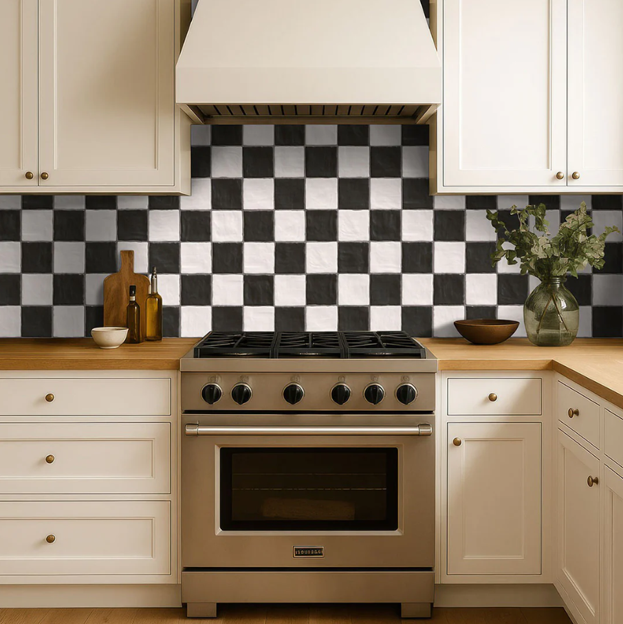
- Dramatic Blacks: Black is powerful, sophisticated, and dramatic. A black backsplash makes a bold statement, creating a sense of luxury and depth. When paired with lighter elements, it provides a stunning contrast that is both modern and timeless.
- Joyful Yellows: Yellow is the color of happiness, optimism, and energy. A splash of yellow can instantly brighten a dark kitchen and create a cheerful, welcoming vibe. It’s a wonderful choice for fostering a positive and lively atmosphere where family and friends love to gather.
- Energizing Reds and Oranges: These fiery hues are associated with passion, energy, and excitement. In the kitchen, red and orange are known to stimulate conversation and appetite. While a full wall might be overwhelming, a red or orange mosaic backsplash can serve as a stunning focal point that injects warmth and personality into the space.
Tying It All Together: Choosing Your Perfect Backsplash
Now that you’re armed with an understanding of color theory and psychology, how do you apply it to your project?
Define Your Kitchen’s Vibe
Start by asking yourself how you want your kitchen to feel. Do you crave a calm, spa-like retreat for your morning tea, or a vibrant, energetic hub for entertaining? Your answer will guide you toward a color family. A serene space might call for cool blues and greens, while an energizing one might lean toward warm yellows or reds. Explore the vast world of kitchen backsplash tile to see which materials and colors speak to you. From shimmering glass to rustic stone, the material itself can add another layer of texture and personality.
Work with Your Existing Elements
Your backsplash doesn’t exist in a vacuum. It needs to harmonize with your existing cabinets, countertops, flooring, and appliances. A great trick is to pull a color from your countertops—like a subtle grey vein in a quartz slab or a warm fleck in granite—and use that as the basis for your tile choice. If your main elements are neutral, your backsplash is the perfect opportunity to be bold and introduce a strong color.
Remember It’s a System
The design principles you use in your kitchen are universal. The psychology of blue creating a clean, calming effect is just as powerful when selecting bathroom tile to design a spa-like escape. Understanding how colors work together empowers you to create a cohesive and intentional design throughout your entire home.
Don’t Forget the Grout!
Grout is the finishing touch that can completely change the look of your tile.
- Matching Grout: Using a grout color that’s similar to your tile creates a seamless, uniform look that lets the color take center stage.
- Contrasting Grout: Choosing a contrasting color (like black grout with white subway tile) makes the shape of each tile pop, creating a bold, graphic pattern.
Your Vision, Your Color
Ultimately, the perfect kitchen backsplash is one that you love. It should be a reflection of your personality and the life you live. Color theory and psychology are powerful guides, but your intuition is the most important tool of all. Don’t be afraid to choose a color that brings you joy every time you walk into the room.
Your kitchen is waiting for its secret ingredient. By choosing a color that sets the right tone, you can elevate your space from simply a place where you cook to a place where you thrive. Ready to find the perfect hue for your home? Explore the endless possibilities at AquaBlu Mosaics and start your transformation today.